Revamping Retail Banking
Backbase | Amsterdam, the Netherlands
Home
Insights
Cards
Help
Goal
Design the retail banking app's dashboard and revamp the information architecture to support an expanding feature set, improving navigation and usability while improving customer satisfaction and driving sales growth.
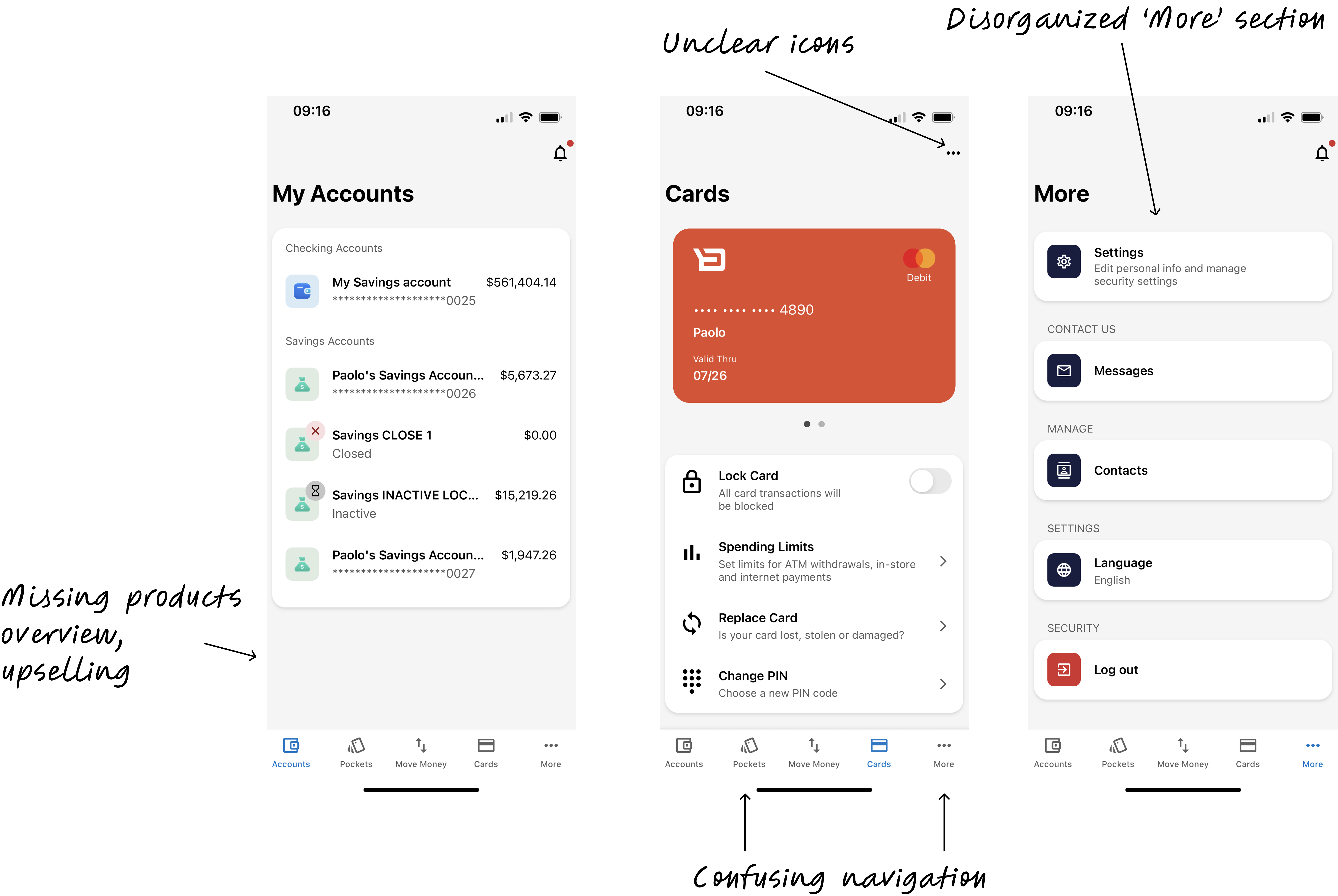
Before the redesign
What we did
To address the challenges and align Backbase's digital retail app with both client and business needs, we:
- Facilitated alignment between product and engineering teams on feature integration priorities and collaboration.
- Analyzed sales data with product to set clear goals and identify key markets.
- Attended quarterly business reviews to understand communication and get buy-in.
- Conducted interviews with clients and client customers.
Presenting findings to engineering directors
Redefining the IA
Content Audit:
- Catalogued every screen and feature in the existing app
Card Sorting and Tree testing:
- Asked bank customers and internal stakeholders to group banking features into categories that made sense to them
- Identified natural mental models and gaps between app structure and user expectations
User Journey Mapping:
- Traced common tasks (checking balances, transferring money, paying bills) to identify friction points and dead ends
Competitive review:
- Examined how best-in-class apps organize complex financial feature sets without overwhelming users
- Identified 'best practice' navigation patterns
- Benchmarked against apps that had solved similar dashboard and information architecture challenges
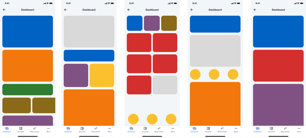
Competitive review: dashboard layouts
Discovery
We began by asking:
- What do consumers expect to see when they first open the app?
- How do users organize and prioritize their interactions with retail banking features?
Here's what I did:
- Deep-dive interviews: Conducted interviews to understand better how people interacted with their retail mobile banking app.
- Designed potential solutions, shared with PM and engineers before testing.
- 2 rounds of concept testing: Conducted concept testing with client customers throughout the design process, and iterated on the design based on the feedback.
The key design decision
We tested two concepts using the same content to isolate the structural question.
Concept 1: Category-based organizes around what things are. Mental model: "I want to check my account balance."
Concept 2: Task-based organizes around what the user wants to do or know. Mental model: "How much can I spend this month?"
The verdict: Neither concept won outright. Users relied on traditional categories when managing specific accounts, but wanted task-oriented answers for spending and goals. The final design uses category-based tabs in the main navigation (Accounts, Cards) while surfacing task-oriented content like spending insights and financial goals on the home dashboard.
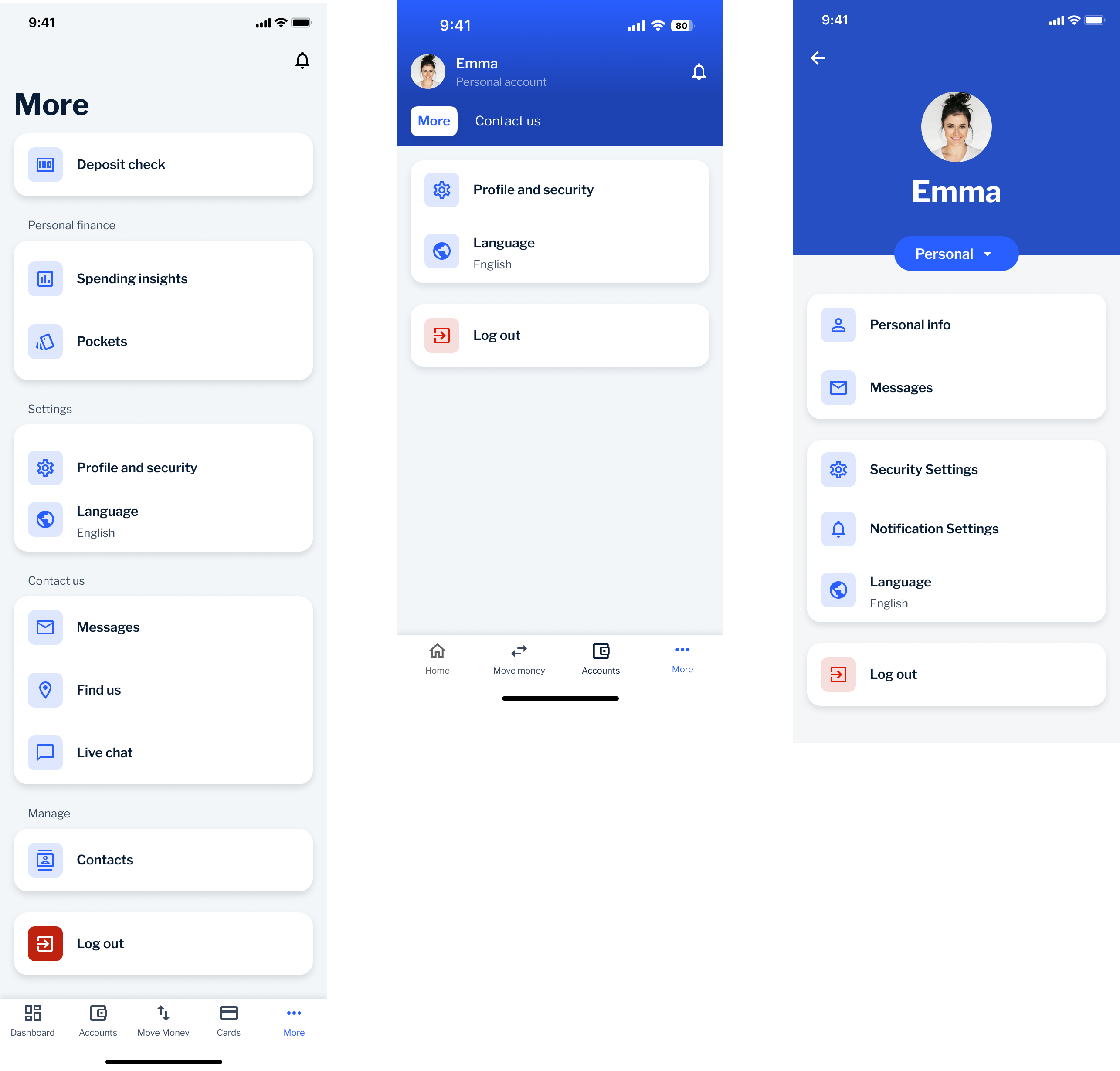
🌪️ Plot twist: Where's the 'More' button!?
Our goal with the new information architecture was to eliminate vague sections, like the "More" tab that had become an easy-to-implement catch-all dumping ground.
However, our research had a blind spot: several clients still insisted on keeping the "More" tab in the bottom navigation, fearing that users wouldn't be able to find essential functions like settings and logout without it.
So, we developed a hybrid approach: we kept the "More" tab to address client concerns, but established a roadmap to phase it out over time.
Evolution of the More section
More as a features catch-all
More in tab bar
More in Profile section
Impact
- 76% of clients preferred the revamped experience over the previous version.
- Established cross-functional collaboration between Retail and Business departments, leading to faster decision-making.
- Initiated a research repository to centralize insights across teams, now used as a standard practice.
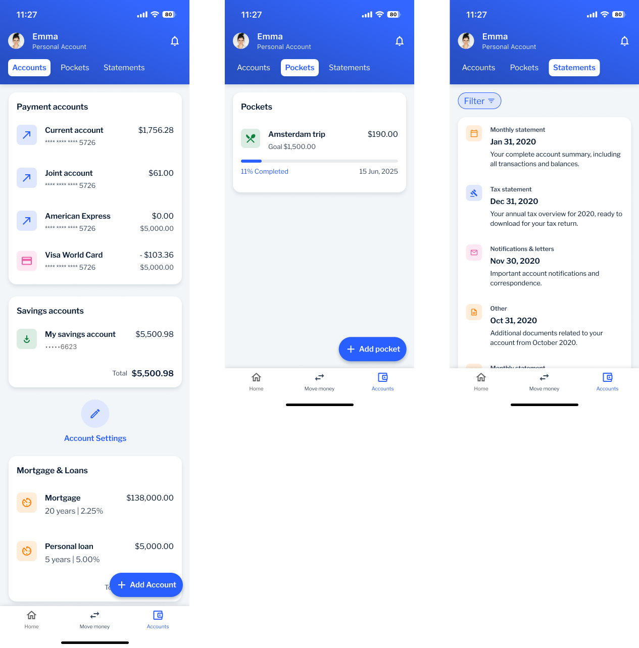
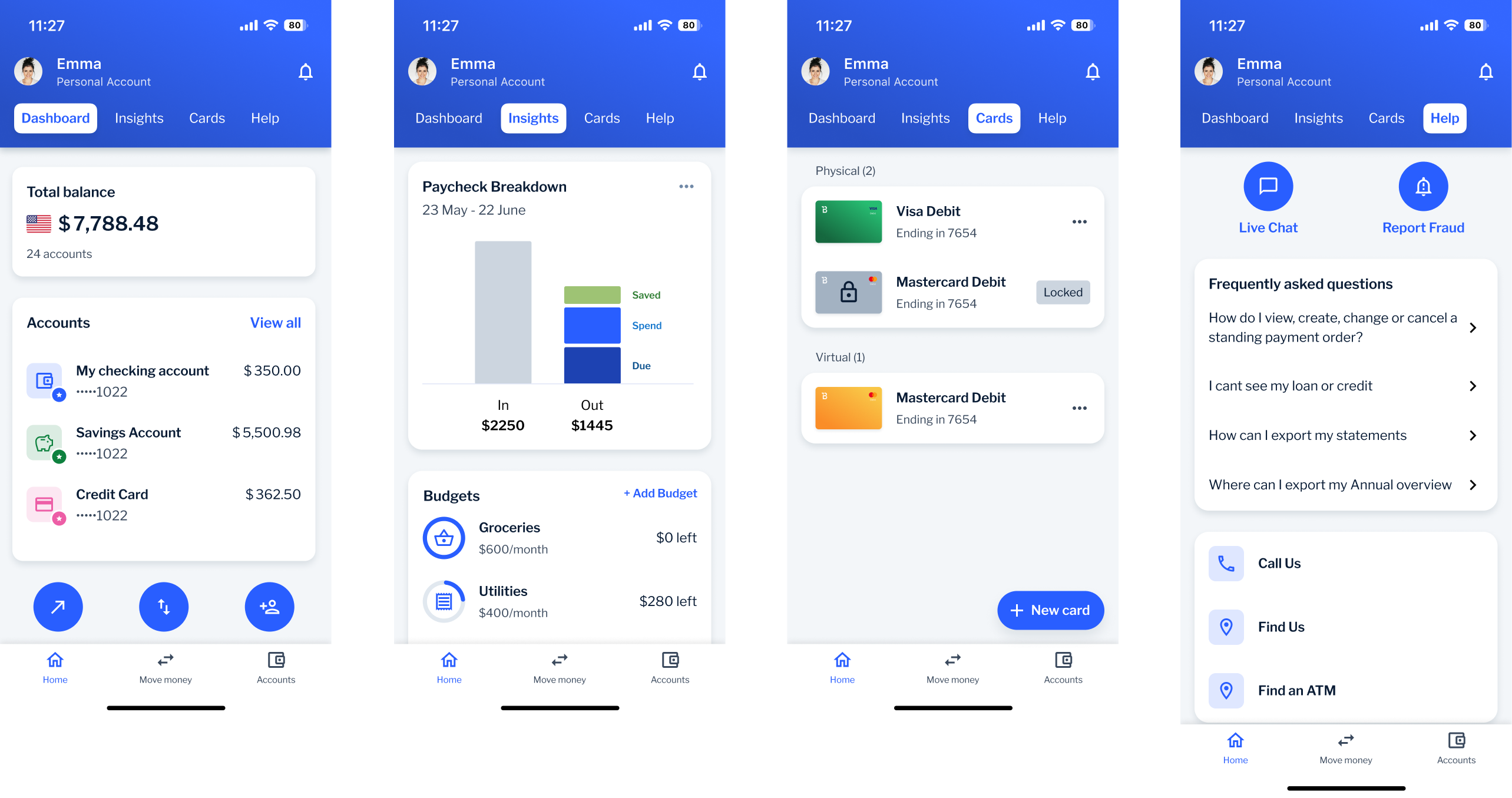
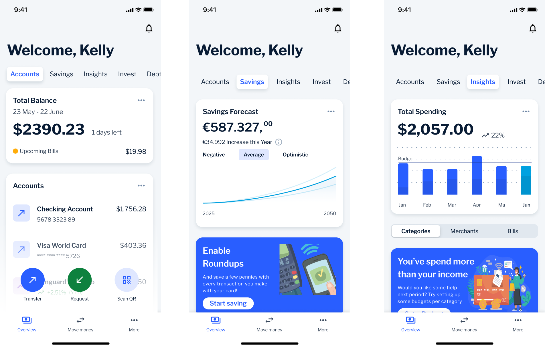
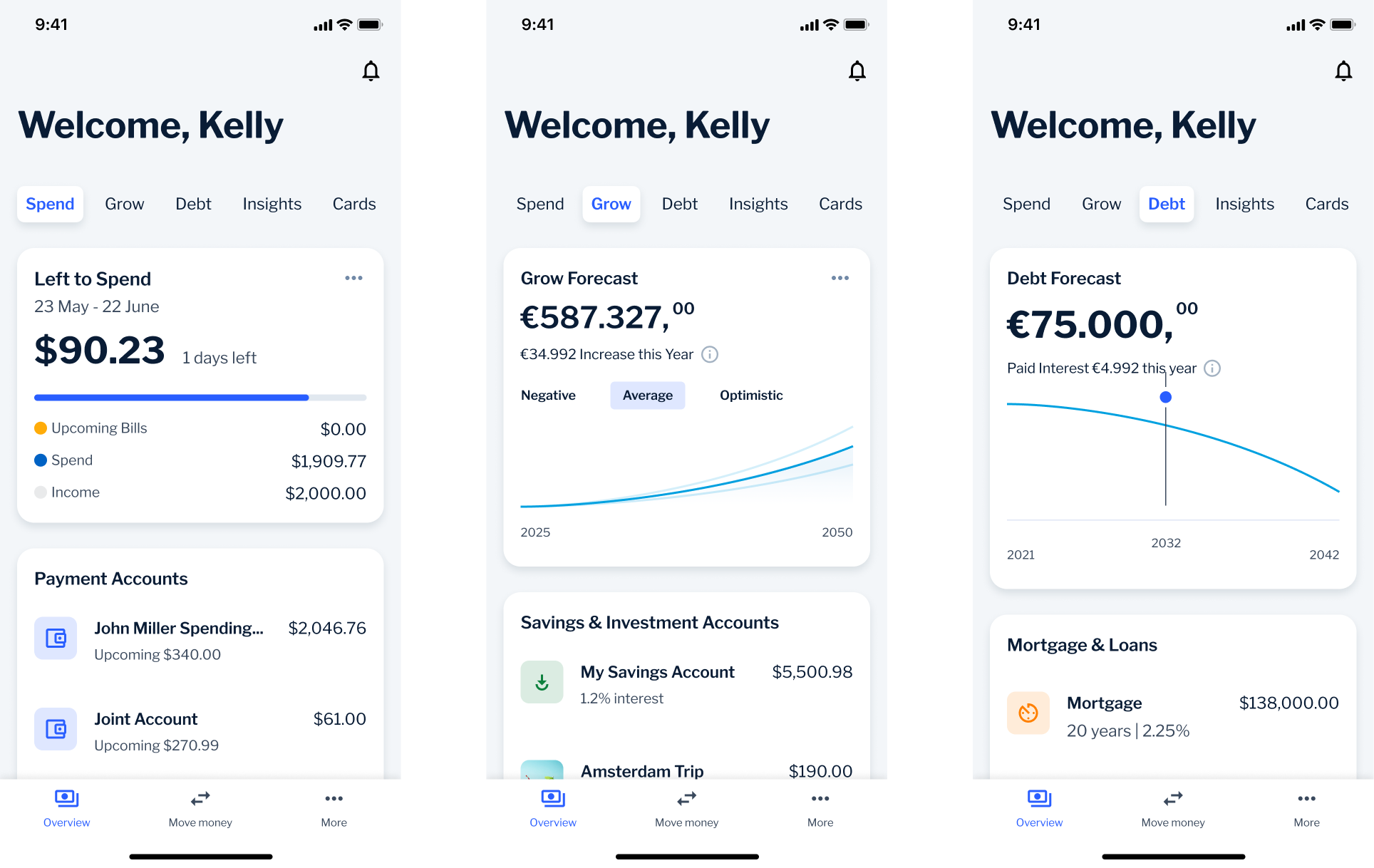
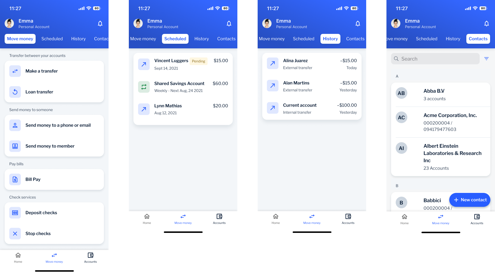
Final screens
Dashboard
Home
Insights
Cards
Help
Move Money
Transfer
Scheduled
History
Contacts
Accounts
Account list
Pockets
Statements