Transforming the End-to-End EF Customer Experience
EF Education First | Zürich, Switzerland
Goal
To design an end-to-end experience that drives bookings and long-term engagement by giving parents and kids the confidence to book their trip abroad.
My role
I led research and design efforts, collaborating closely with a multidisciplinary team, including designers, developers, a creative director, a product manager, videographers, and UX writers.
Impact
My work influenced EF’s strategic direction, leading to key hires, improved customer engagement, and clearer decision-making across teams.
Customers in a key market doubled their online bookings within one year, we launched in new markets, and internal collaboration became faster and more aligned.
Where we started
User challenges:
Pre-booking: Users struggled to find relevant, inspiring content. Stock photography and generic messaging failed to connect with kids and parents.
Post-booking: Engagement dropped, with missed opportunities to build loyalty and satisfaction.
Internal challenges:
Operational inefficiencies delayed customer communication.
Tools and processes didn’t fully support decision-making clarity.
Our first steps
To address challenges and align EF’s digital experience with both user and business needs, we:
Persuaded senior leadership to adopt authentic, user-centered content.
Analyzed sales data to set clear goals and identify key markets.
Conducted interviews with students, parents, and internal teams to uncover their experiences and needs.
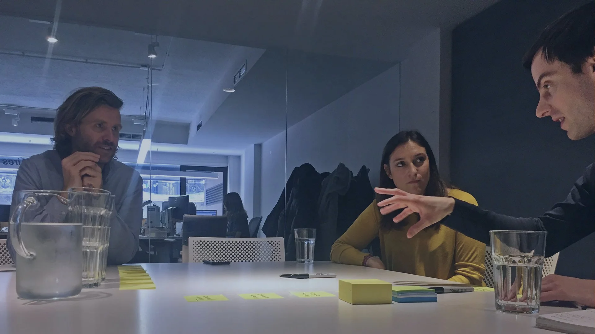
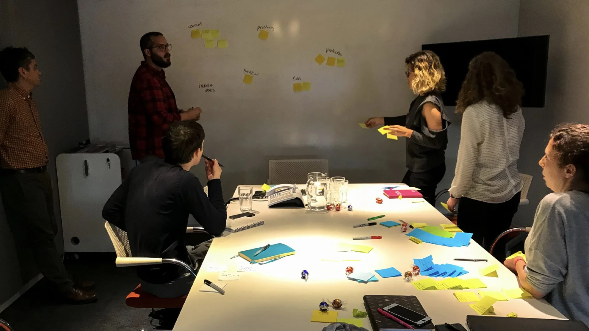
Led cross-functional workshops with marketing, sales, and customer service teams to:
Create a Customer Journey Map to highlight pain points and opportunities.
Develop a Service Blueprint to streamline operations and align internal processes with user needs.
Mapping
1. Customer Journey Map
We mapped the journey from inspiration to post-booking, uncovering key insights:
Frustrations: Users faced unclear information during the decision-making process, leading to hesitation and drop-offs.
Opportunities: Engagement gaps were identified after booking, during the trip, and after returning home, presenting opportunities to strengthen loyalty and satisfaction.
These findings shaped our priorities for content, communication, and product improvements, ensuring a more seamless and engaging user experience.
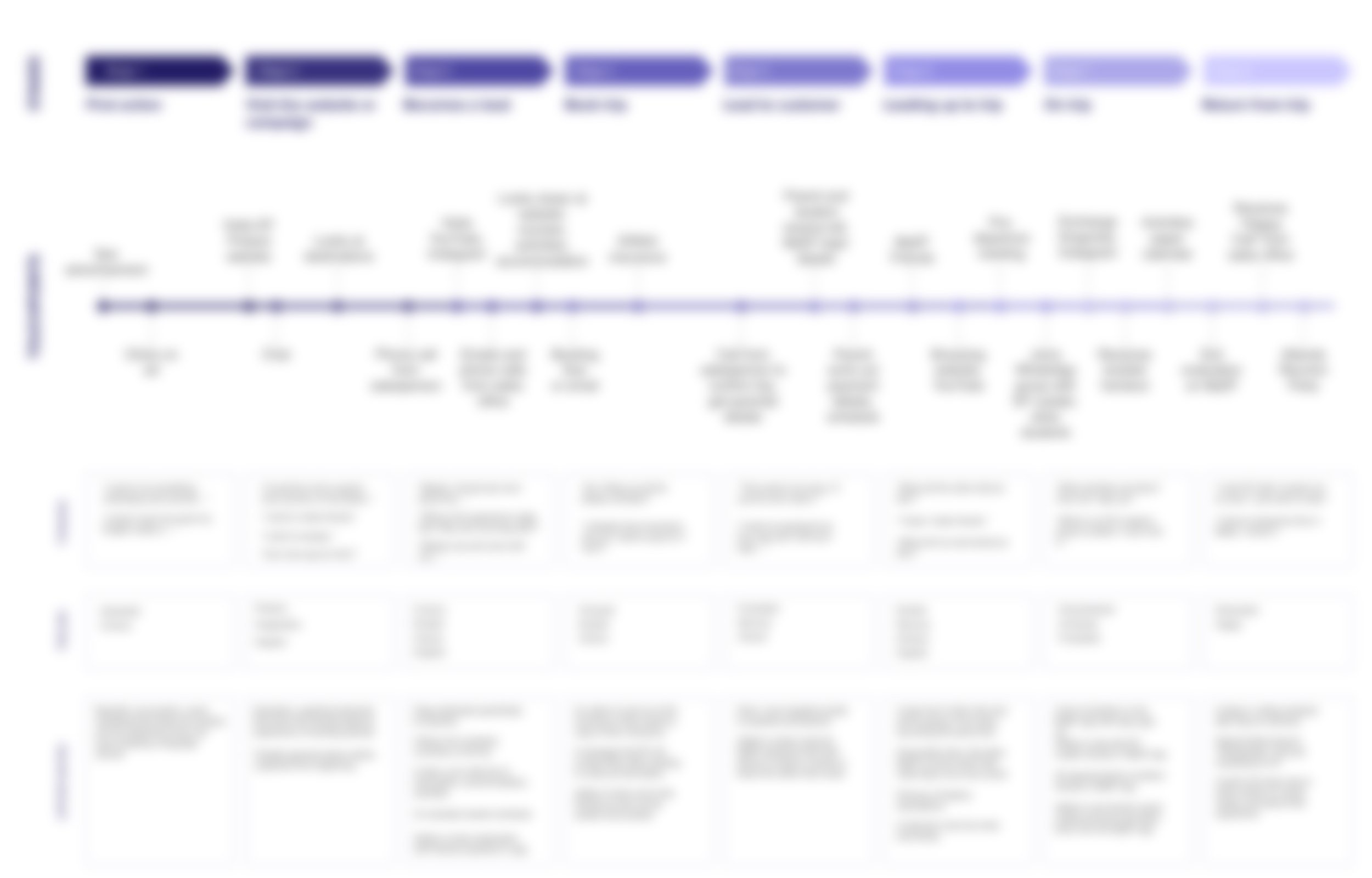
Customer journey map blurred to protect company confidentiality
2. Service Blueprint
The service blueprint aligned internal operations with customer-facing touchpoints, revealing breakdowns like:
Delayed parental notifications after students arrived
Lack of clarity around communication responsibilities
This work influenced the hiring of a VP of Customer Experience to streamline processes and improve touchpoints.
Design process
We moved from sketches to wireframes to polished mockups, grounded in user research. The design focused on clear storytelling, authenticity, and visuals that would inspire and inform students and parents.
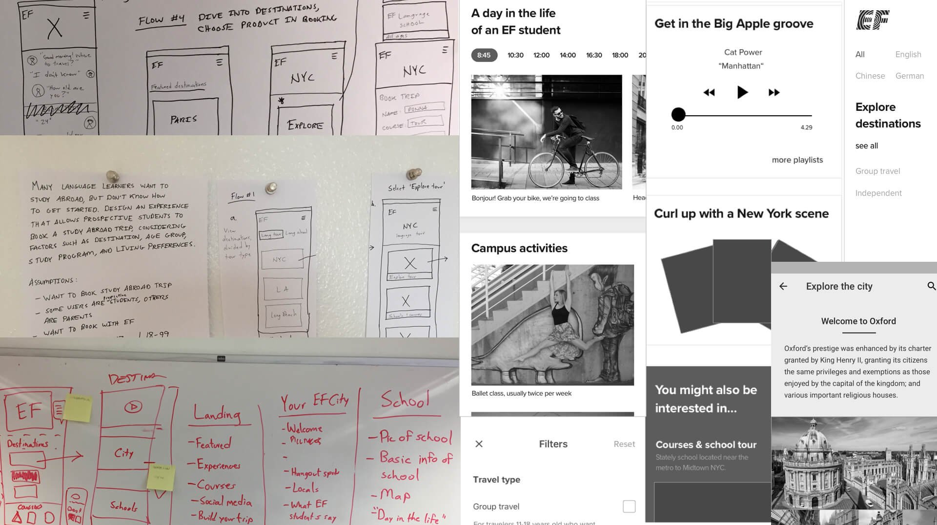
Early phase prototype
One key opportunity from our customer experience work was improving the booking flow, a high-friction, high-value part of the journey.
Problem
The booking flow was hidden in a hamburger menu and cluttered with dropdowns, leading to confusion and high drop-off rates.
Leadership initially hesitant to change it, fearing it might hurt conversion. EF prioritized a separate price quote tool over improving the actual booking experience.
Through user research and analytics, we made the case that pricing should be integrated directly into the booking experience to build trust and improve clarity.
I led the redesign from discovery through delivery, exploring multiple versions and collaborating with product and engineering to deliver a cleaner, more transparent flow.

🌪️ Plot twist: Age selection
👱♀️ Teen Programs (13–18 years)
EF Junior Course – General (13–15 years)
EF Language Travel (16–18 years) — the standard travel + language combo
🧑🎓 Young Adults (18–25 years)
EF Intensive (standard adult intensive course)
EF General (mid-level adult course)
EF Basic (no-frills general adult course)
Official Language Exam Prep (exam-focused)
👔 Career & Professional (25+)
EF Language courses abroad
EF Academic year abroad
Question: how to combine all of these products into one seamless flow on the product website?

Discovery: booking flow
For the booking flow research, I set aside all of our technical and political constraints and asked simply: when a student is ready to book, what does she actually want to do first?
Here’s what I did:
Benchmarking: Analyzed competitor booking flows to identify best practices.
User testing: Conducted interviews and concept testing with students and parents throughout the design process, and iterated on the design based on the feedback.
This question and further research led me through several sketches and booking flow iterations, three of which I prototyped and tested.

Concept 1: Choose date first —> then course

Concept 2: Choose course first —> then date

Concept 3: Choose by month (button layout) —> then course

What we decided
We moved forward with a combination of Concept 2 and 3, based on:
Ease of implementation (Concept 2): Reused existing APIs
User preference for starting with course (Concept 2):
“I want to pick my course first, then figure out the dates.”
Simpler date selection (Concept 3):
“It’s easier to choose my options this way.”
Final design
The final flow focused on clarity, flexibility, and trust.
We surfaced key decisions at the right moment and integrating pricing transparently throughout.


🌪️ Another plot twist: chatbot integration
We focused on revamping all of the content and the booking flow—but in our research, we discovered that Finnish users are less likely to call or visit an office. A beautiful design wasn’t enough. We needed a comfortable, low-pressure way for kids and their parents to engage with us.
I proposed introducing the Intercom chatbot. I trained the sales team and even traveled to Barcelona and Milan to support local teams in using it effectively.
Yes, this wasn’t in my job description as a UX designer.
I did it anyway.


Impact
Launched a new digital experience featuring authentic content and a simplified booking journey
Presented research and design work to EF’s President, EVP of Marketing, and senior leadership — influencing company strategy
Led to the hiring of a VP of Customer Experience and a full-time videographer
Insights informed the roadmap for content, product, and operational changes
Results
Increased engagement within 3 months of launch
Faster response times through a streamlined chatbot experience
In a key market, online bookings doubled within one year
