EF Finland
2017 - 2018 | EF Education First | Zürich, Switzerland
Research and design an end-to-end journey where students discover great content that makes them excited and informed enough to book a language course abroad online.
Team
UX Designers, UX Writer, Engineers, UX Researcher, Creative directors, Product Manager
My roles: UX Researcher and Designer
Deliverables
Research diaries
Presentations
New digital experience
Approach
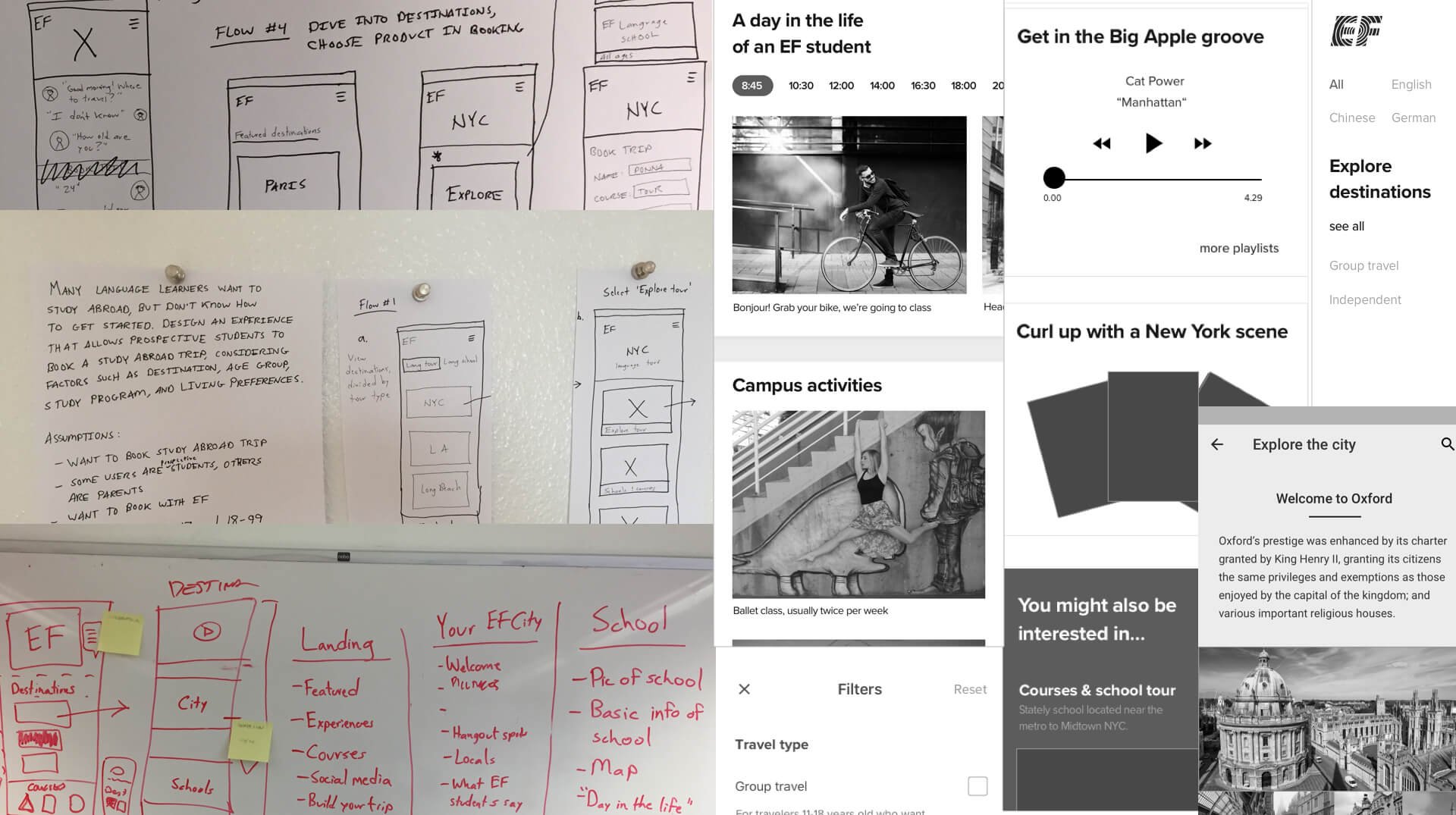
After senior leadership gave us the brief, I had to understand if their assumption - that people would book an expensive language course directly online - was valid. I flew to Helsinki and did a deep dive with customers and the sales team, learning about students and parents and the sales process, students' motivations to learn a language abroad, and how technology could help them make the decision to book easier.
From this research, I sketched user flows and created wireframe prototypes and then tested them in the Helsinki sales office to better understand how users would be more likely to book directly online.
Process
Research was ongoing throughout the design process. Here are some of the decisions we made:
1. Combining products, age group selection
The first biggest obstacle we encountered was that we had two different products with separate websites: independent travel and group travel. Within each of these products existed five different age groups. The company asked us to combine them all within one user flow.
After testing and iterations, we decided to put the age group selection after the homepage but just before destinations are presented within the flow, so that the destinations shown are specifically for them, with content that is tailored for that age group.

1. All users, all ages, tap 'Explore destinations'
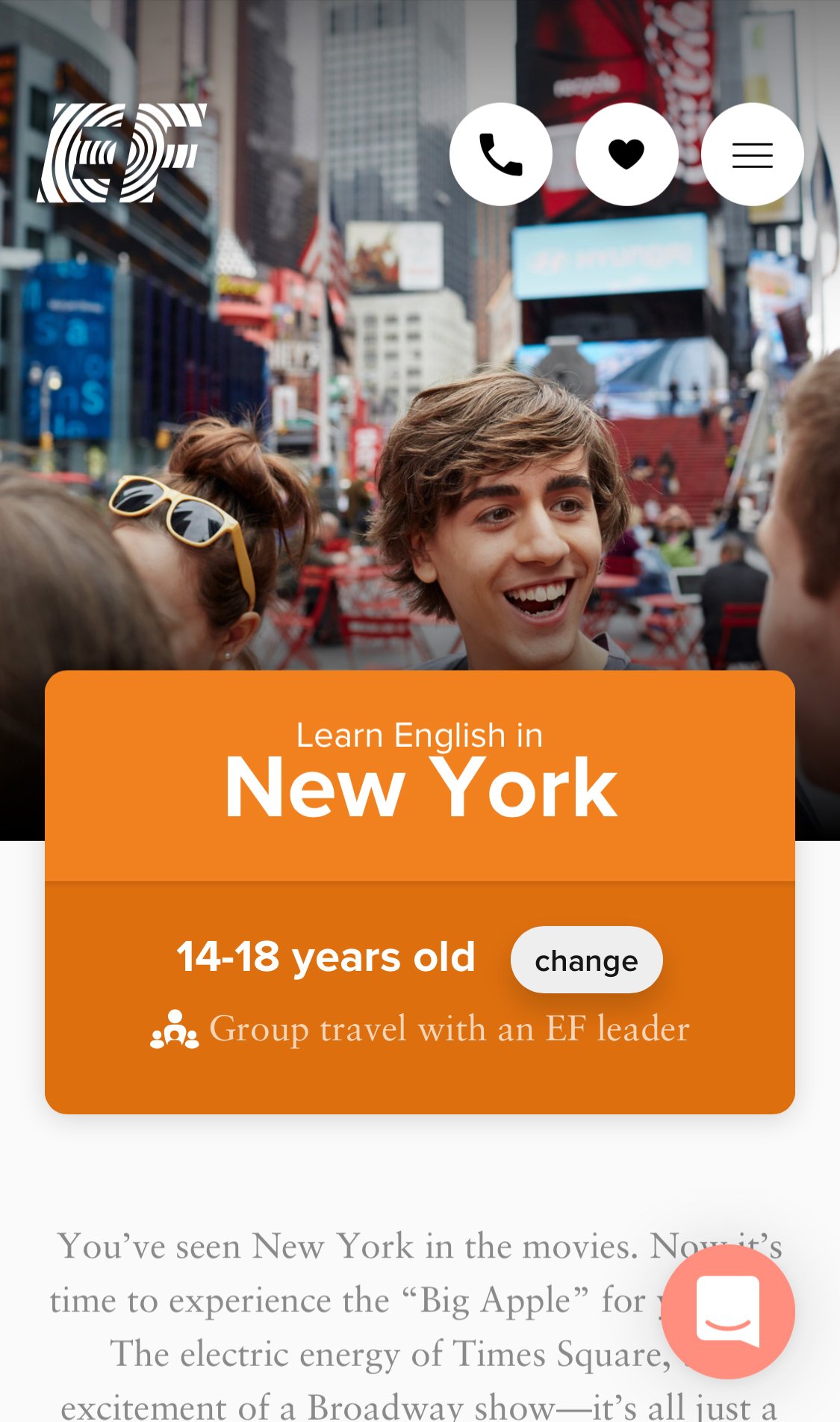
2. A first time visitor is given the option of selecting an age group within the context of travel type
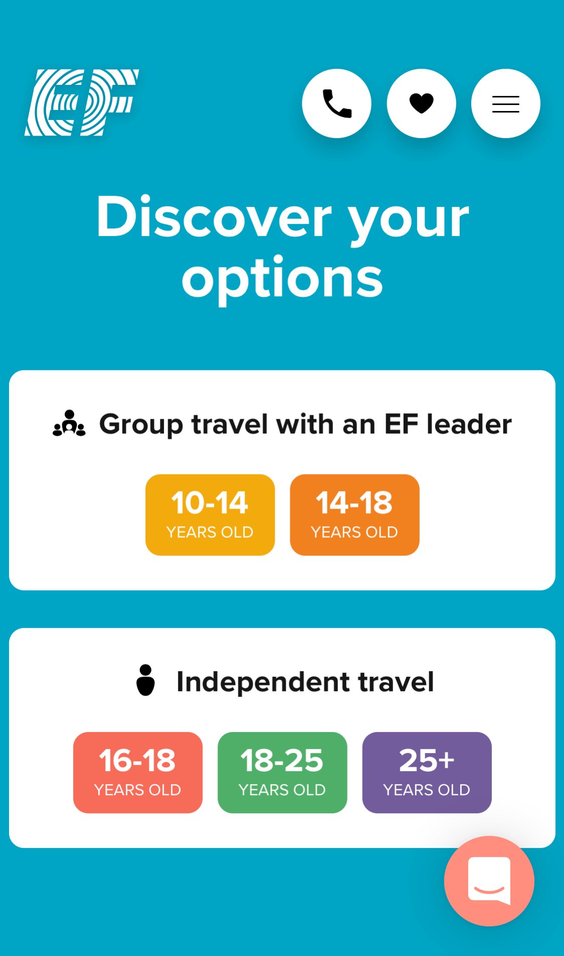
3. A user can now see destinations for their age group while still being able to change the age at any time in their journey
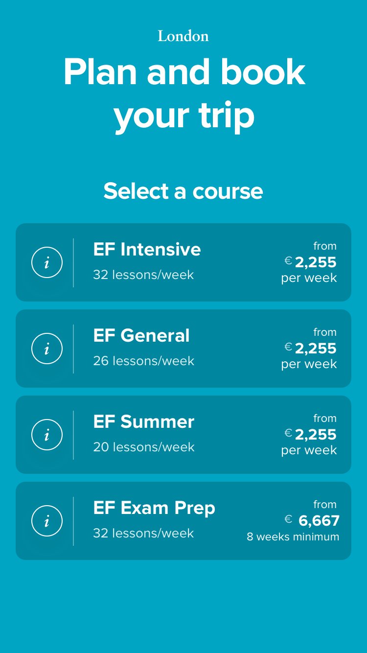
2. Booking flows
Another challenge were the booking flows, which I couldn't change completely because they had to rely on an existing API from the global company (over 53 countries). But in research, I set aside our technical constraints and asked simply: when the user is ready to book, what do they want to do first?
This question and further research led me through several booking flow iterations, three of which I prototyped and tested with users:
Concept 1: Choosing course dates via a calendar, then selecting a course

Concept 2: Choosing a course, then selecting dates via a calendar


Concept 3: Choosing dates with buttons instead of calendar, then making a course selection
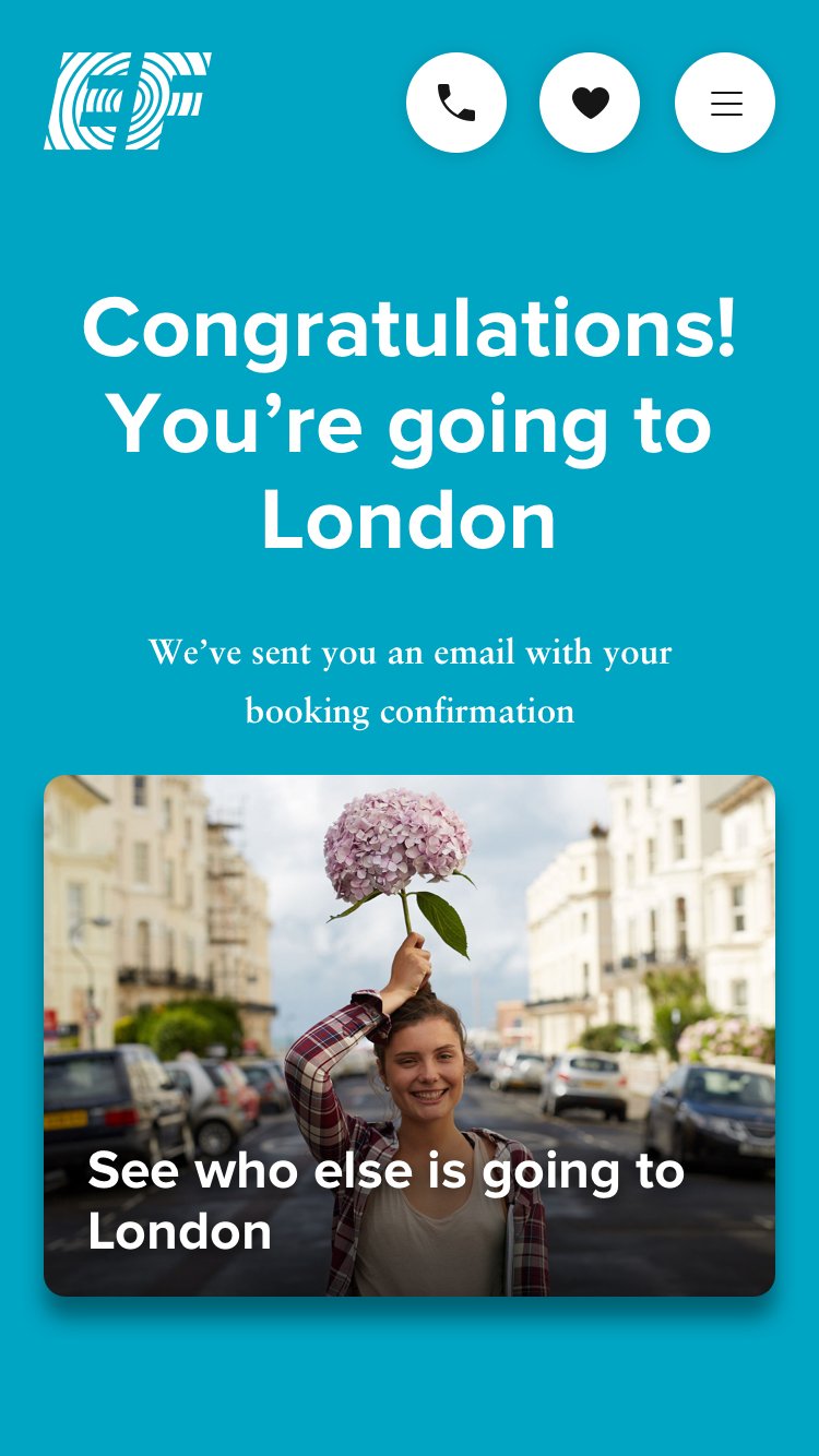
Winning design:

3. Destination page filters
I learned from the sales team that many customers have difficulty choosing the right destinaton. To help users make the right choice, I worked with customers and the sales team to understand how we can help customers with this decision making process. After interviews, I came up with filter selections to help users narrow their top picks, depending on destination type (beach, city, or college town), activities (swimming, volleyball, dance), and more...

A simple prototype I created using Framer for user testing.
Impact
We shifted the company paradigm of what makes an online experience successful: instead of asking potential customers for contact information through primary CTAs, the internal conversation has shifted to creating a content-rich website that promotes booking directly online. In addition, one year after launch, customers are booking twice as much online as they did in the previous year.
