Customer journeys
2018 - 2019 | EF Education First | Zürich, Switzerland
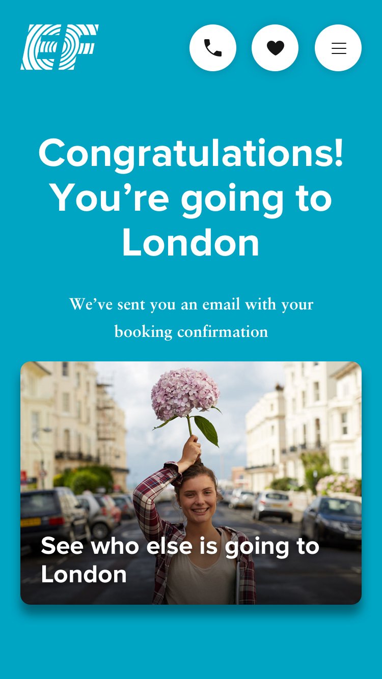
Researched, designed, and launched end-to-end journeys that engage students with compelling content, informing and inspiring them to book a language course abroad online.
Video deliverable
From the research, I created a video with a videographer showing what happens when parents send their child on an EF language trip. I conducted all the on-camera interviews, drew the storyboard, directed the editing changes, and pushed it live onto the product website.
Team
As a product researcher and designer for this project, I worked with designers, engineers, UX writers, creative directors, and a product manager.
Deliverables
Research diaries, presentations
Personas
Video
Wireframes, prototypes
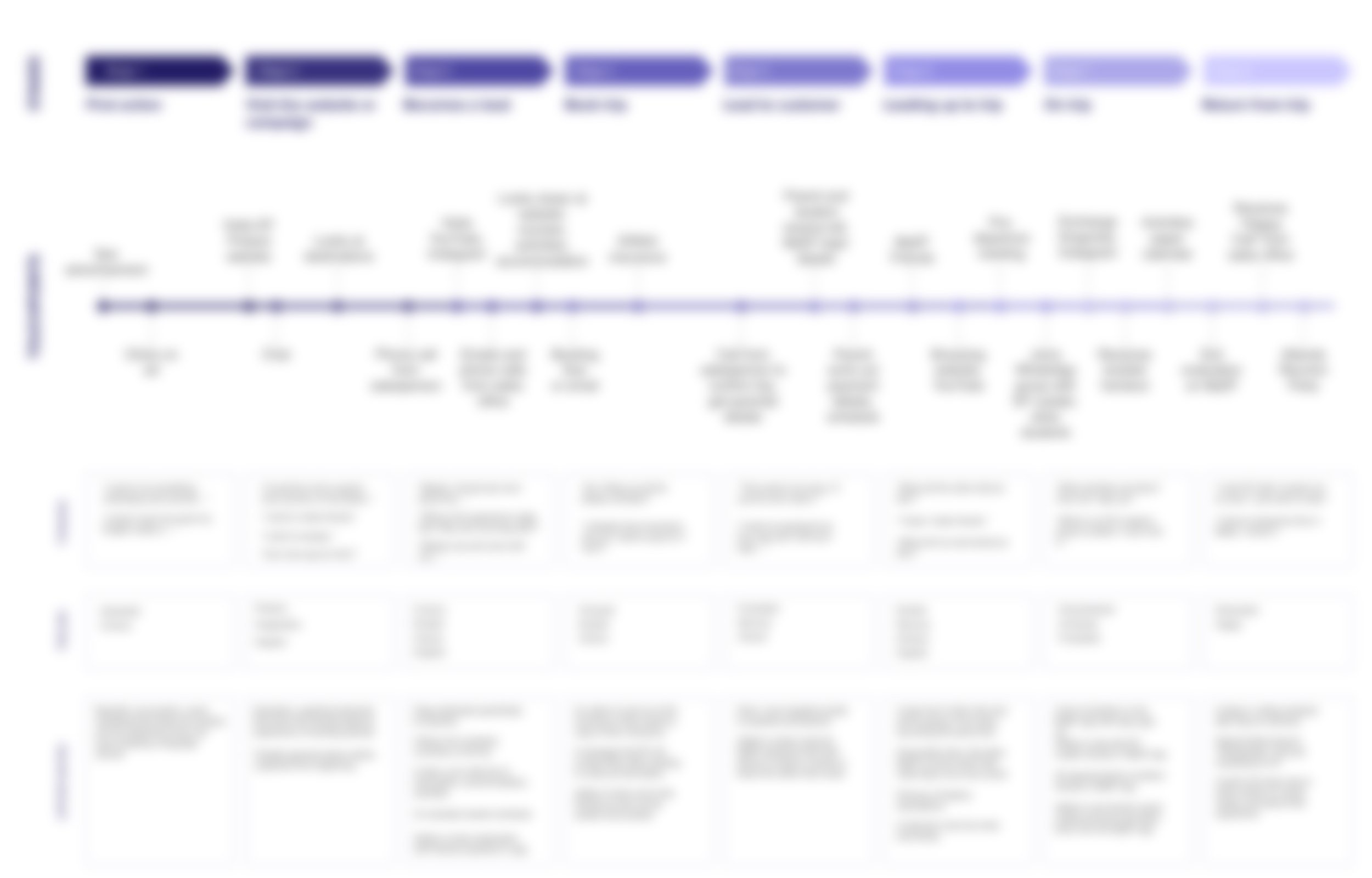
Customer journey diagram
Approach
Our task was to determine how to encourage students and parents to book expensive language courses directly online. EF Education First, a sales-driven company traditionally relied on brochures and direct sales calls, needed to shift towards a digital approach to reduce production and labor costs.
In Helsinki and Barcelona, I conducted deep dives with customers and sales teams to understand the sales process, students’ motivations for learning abroad, and how EF could simplify the online booking process. My research uncovered how we could streamline decision-making and increase the likelihood of students and parents booking directly through the website.
Research methods
Ten to fifteen student interviews in each market, Finland and Spain
Four to five parent interviews within each market
Eight to ten sales coordinator and customer service team interviews within each market
Conducted an affinity diagramming workshop and a sales blueprint exercise with marketing, sales, and customer service representatives.
From this research, I sketched user flows and created wireframe prototypes and then tested them with prospective Finnish, Spanish, and Catalan customers.
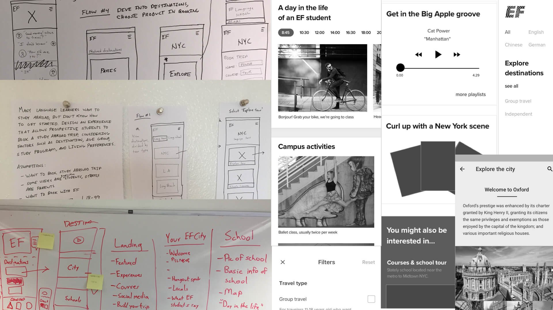
Design process
User testing was conducted continuously throughout the design process, ensuring we gathered valuable insights at every stage. Additionally, we implemented A/B testing on various options, experimenting and iterating as we refined the product.
Some of the key decisions we made include:
1. Combining products, age group selection
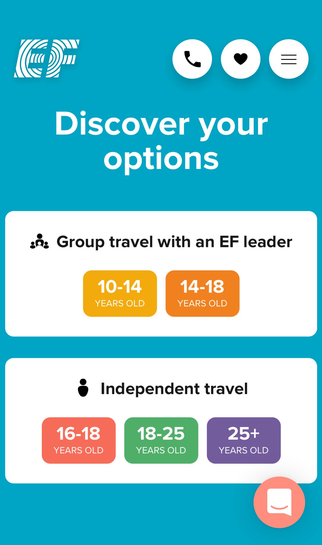
The first biggest obstacle we encountered was that we had two different products with separate websites: independent travel and group travel. Within each of these products existed five different age groups. The company asked us to combine them all within one user flow.
After testing and iterations, we decided to put the age group selection after the homepage but just before destinations are presented within the flow, so that the destinations shown are specifically for them, with content that is tailored for that age group.
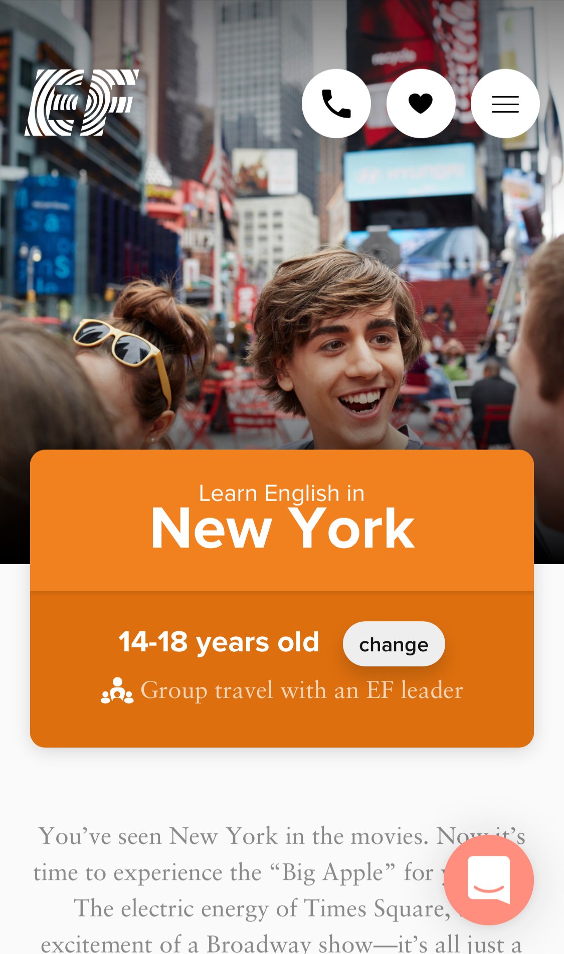
1. All users, all ages, tap 'Explore destinations'
2. A first time visitor is given the option of selecting an age group within the context of travel type
3. A user can now see destinations for their age group while still being able to change the age at any time in their journey
2. Booking flows
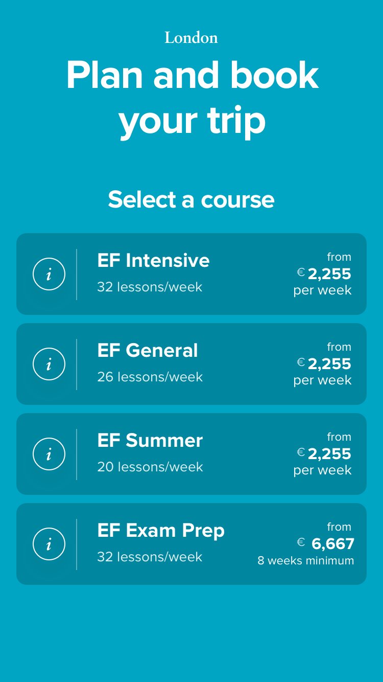
Another challenge were the booking flows, which I couldn't change completely because they had to rely on an existing API from the global company (over 53 countries). But in research, I set aside our technical constraints and asked simply: when the user is ready to book, what do they want to do first?
This question and further research led me through several booking flow iterations, three of which I prototyped and tested with users. Ultimately, we got a:
🥇 Winning design:
3. Destination page filters
Customers struggled to choose the right destination, so I collaborated with users and the sales team to improve the decision-making process. After interviews, I introduced filter options to help users narrow choices by destination type (beach, city, college town), activities (swimming, volleyball, dance), and more.
A simple prototype I created for user testing.
Impact
Launched a new digital experience for EF, focusing on rich content that inspired kids and parents to book a language course abroad.
Presentations to the company president, EVP of marketing, and other leadership, helping to shift the company strategy on online booking.
Leadership hired a VP of Customer Experience.
Collaborated with the product manager as this research directly impacted the product roadmap; uncovering ripe research, design, content, and product opportunities.
Hired a full-time videographer, focusing on creating authentic content for the product destinations.
One year post-launch, Finnish customers doubled their online bookings compared to the previous year.

